I used the fonts that got > 50% of the votes in the previous poll. I could add another with a different ‘g,’ but short of making our own font by committee these polls are always going to be a bit biased. I don’t think the poll should be binding either; for me it’s more of a gut check to make sure I didn’t make / choose something that everyone hates.
Thanks everyone for the feedback! This is an important decision, so it’s vital to get lots of feedback. Unfortunately, unlike code it’s not such an easy thing to collaborate on. The images that I’m posting are all SVGs and should be relatively straightforward to hack on if people want to try things out – I’ve been using Inkscape to generate all of these images so far, and everyone is free to try out tweaks or different fonts or whatever they like.
At the dev meeting we talked a bit about how to make visually distinct favicons with the logo/banner that received the most votes.
For reference, here’s what that logo looks like as a Favicon (alongside some others):
IMO, looks alright. But the tuning curves are probably too small to be visually distinguishable at a glance if the only difference between favicons is a change in the three colored tuning curves. So one option might be to color all the tuning curves by a given project’s main color. Hypothetically, if the GUI were purple, it could have this logo:

Which results in this favicon:
This could work, but it’s a bit hard to see at a glance. Another option is to have the color be part of the background instead, and have the stylized N be a silhouette. Here’s what that would look like.

This looks pretty bad to me. I think what makes it looks weird is that the tuning curve making up the N and the other three tuning curves are given the same weight, which just ain’t right. Given that it’s a silhouette, we can decrease the weight by making the lines thinner or by making them somewhat transparent. Thinner lines seems meh to me, so here’s what it looks like when the other three curves are the same amount of transparent (about 50%):

Here’s one where the transparency goes down progressively (i.e., the top curve is fully opaque, the next is about 20% transparent, then 40%, then 60%):

This got me thinking that you could do a progressive transparency thing when not in silhouette as well. Here’s a quick sketch of what a Nengo GUI banner could look like if it were to choose this purple as its primary color, and went with a sans-serif font for the “GUI” part.

The GUI part looks like of bare so I tried outlining it…

Looks kind of weird so I also tried bolding it.

Not sure I’m sold any of these specifically, but I like the general idea of it.
What does everyone else think?
Not sure if I like the purple, but I think I like the solid background. A few minor things:
- I might use a little bit more padding on the top and bottom.
- Because of the transparency there are slightly brighter parts where the curves overlay. It might look slightly better when emulating the transparency with solid colors.
Concerning the Nengo GUI banner, I think that the choice of fonts doesn’t go along very well. It just looks like the Nengo and GUI part do not belong together. I’d try the Nengo banner font for the GUI part first. If we were really to use a different font, we should take more care about matching the fonts (definitely not an easy task).
Another idea that might make the colored GUI look better: Use the same trick as for the icon, a solid colored background with white letters on it. Somewhat like the Youtube banner.
I like Jan’s idea too, add the ‘GUI’ beside the Nengo banner in a coloured background. I also like the favicon with coloured logo and constant transparency (as opposed to progressive one) as it highlights the ‘N’ more I think.
I like having the tuning curves the same colour as the project (i.e. GUI), not sure if this should have transparency though… Moreover, if each project has specific colours for the banner tuning curves, is the generic umbrella logo going to use multi-coloured tuning curves? I think that makes sense.
Great work @tbekolay!
So I probably should have been more explicit, but the Nengo GUI banner was just a quick mockup of the general idea that project banners would have the N stylized with the primary color, and the project’s name also colored that way. It’s cool to toss around some ideas, but there will have to be separate threads for each project to determine its own spin on the logo / banner. Likely those discussions happen in Github – this one’s here because it affects every project, including the styling of the forum. So, don’t spend too much time or energy thinking about the Nengo GUI banner.
The main point of contention at the dev meeting was the favicon; specifically, how can we ensure that it looks distinct at a glance for different projects (“is this tab the GUI or the forum?”) I fixed up the overlaying transparency issue that @jgosmann pointed out (thanks for that!) and tried out a few different spacings between the logo and border.
Here it is with the spacing from before, but with the transparency issue fixed. If you want to refer to this later, call this Favicon 1.

Here’s with some added spacing (Favicon 2):

Even more spacing (Favicon 3):

Even more spacing (Favicon 4):

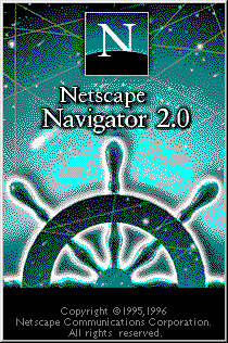
Really a lot of spacing (Favicon 5):

I didn’t tweak the rounding on the rectangle in these, but probably that could be tweaked a bit. I think my preference is probably Favicon 3? Thought it’s not a very strong preference. I think with Favicon 5 I worry that it looks a bit too much like this throwback that 90s kids will definitely remember.
Because it sounded cool to me too, I whipped up the Nengo GUI banners that were suggested (though like I said above, we should probably leave any comments on these to a future Nengo GUI specific logo design discussion).
First with all tuning curves the same:

Then with the progressive lightening. Note that, like the favicons, I changed this to do the lightening with solid color changes rather than transparency so there are no issues with overlaps.

Another point of contention was about fonts… if anyone wants to suggest a font (for the “engo” part, I think the N is pretty solid now) then please do so. Aside from that, what do people think about the favicons?
I like the favicon, 3 is my favourite too, 2 or 4 might work too.
For the banner I prefer the curves that fade out and also the GUI part with solid background. Still have to think about the fonts. Btw: What fonts did you currently use?
The three “finalist” fonts were Eligible, Sura, and Crimson text; the one that got the most votes is Eligible. I didn’t notice before but apparently Eligible’s author made a sans serif version which could be useful.
I searched for some more fonts suitable and similar in style to Eligible:
- Sanchez (probably my favourite)
- Rokkitt
- Crete Round
The Google Fonts site is really nice. You can type in your own text to preview and they show popular font pairings which could be helpful if we indeed want to use a different font for the GUI/SPA/whatever part of the banner.
Rokkitt was actually one of the fonts in the original fonts poll  I hadn’t seen Sanchez before though, I really like it too. Here’s another poll with those font choices (including Eligible and Eligible sans, for kicks). Note that these all use the same N (from the Eligible font) but in general the Ns are pretty similar in most of these… I can remake the N if people think the N looks off with the “engo” with the chosen font.
I set this so you can choose up to 2, though if you prefer to just choose one then just choose one!


0 voters
This is coming along really well. I like favicon 2-4 as well. I also super like the different alphas/shades on the tuning curves… Brilliant! Captures the ‘same yet different’ feel from the original N.
1 Like
Those are gorgeous favicons. And of 2-4 look great to me, with a slight preference for #3. I very much like the silhouette approach. Thank you!!! 
1 Like
OK! One last (I’m pretty sure last) decision… the Sanchez font won in that poll above, so I made an N using the Sanchez font’s N. Here’s a poll for the Eligible N vs Sanchez N.


0 voters
It’s by a razor thin margin, but the poll plus the fact that the Sanchez N more likely matches with the rest of the text means we’ll go with that one. I think with that we can close this discussion for the time being. My next step is to make a PR on the nengo.github.io repo with these assets and some guidelines / steps for each project to follow for making their logo. Any lingering issues can be discussed there.
Thanks everyone for all the feedback!