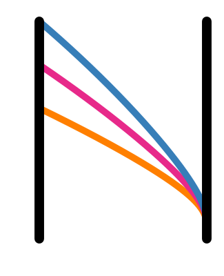
OK, so I tried out making the N among other tuning curves, and I think it could actually be decent with a bit of tweaking. The key thing with the N among the tuning curves is that it makes sense to vary up the tuning curves a bit more, which skirts the pentagram / jester hat concerns. So here’s what the 6 curves look like with different colors:
Then something like this could be the full Nengo ecosystem logo:
using just this when we need a square / smaller logo (e.g. for the nengo_gui icon):
Each project could then take a different color for their logo; e.g.:
This would make it straightforward to brand each individual project, and would mean that we don’t really need a “Managed by Nengo team” badge; anything that’s had a release would get a logo like this, and projects with that style of logo are managed by Nengo team.
I would want to look at more options for the “engo” font/styling (for sure the thickness of that text should match the thickness of the tuning curve, didn’t notice that until now), and I think the N tuning curves are a bit too wide (and the joint at the top-left looks weird) but what do people think about this general idea? If there’s support I’ll teak it and then post some possibilities for font styles.
Exact colors are not set in stone, we could definitely to the branding-by-color thing.
I think that it might look better by adding serifs to the N (to make those perfectly straight lines a bit easier on the eyes). The exact aspect ratio and line thickness might also need some tweaking. If we were to use this logo, I might make a version based on the font used for the full name to have it integrate nicely.
I still like the simplicity, uniqueness and jester-hat-edness of the black underlined tuning curves. That being said, when it comes to graphic design it’s usually a safe bet to go in the opposite direction of my preferences.
OK! So I think we can reasonably narrow it down to 4 broad choices now. Each one has a variety of fonts to search through, but it’ll be easier to pick fonts once we have choose between these four choices. Below the poll, each choice is shown with just the icon, plus icon sizes, and then with text. (@jgosmann I hope I did your idea justice!)
Please vote in this poll by Monday, January 16 at noon! Remember that the text font and coloring can easily change, so just choose based on the overall impression. I’ll close it early if there’s overwhelming support for one option so I can move onto generating font options.
Still deciding what to vote for, but I thought I share some of my thought process:
Curves with axis: While the logo work on it on, it makes the Nengo banner look like “_Nengo”. I don’t like that because that makes the axis some sort of visual noise. Though, I might wonder how it would look to use that in names like “Nengo_GUI”.
Curves without axis: I think this works pretty well either as standalone logo or as banner. Compared to earlier versions the aspect ratio of the tuning curves changed slightly (it seems to be taller then wide now) which makes it look much better too me (no more jester hat).
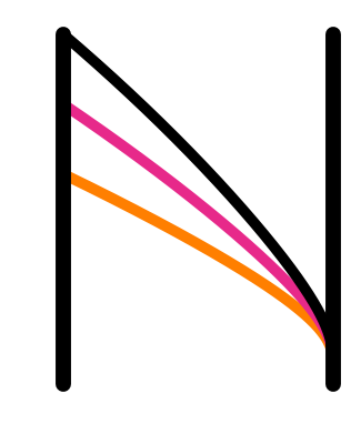
N among the curves: This looks good to be as the banner, but as the logo the N is too obscure for me, but the black of the N also obscures and distracts from the other tuning curves.
N made up of curves: I see the potential for this to look good as stand-alone logo or banner but it will require some tweaking (hardly @tbekolay’s fault as this was also true for my initial proposal).
Despite making the poll, I also couldn’t decide what to vote for… in general I agree with @jgosmann’s thoughts, so I started playing around with some other ways to do the N made up of curves; specifically, I wanted to see what it would look like with a serif font. I had some thoughts about having the curves also turn into serifs (so it’d have 3 serifs), which could still be done, but I wanted to post these anyway as I think they look pretty good as is, both as stand-alone and a banner. Some tweaking is still in order, but check these two out! In case you don’t notice, the main difference between the fonts is the style of “g”.
We could also use the black ‘N’ hidden in the tunig curves as the banner, and remove the colour for the stand alone logo, i.e. use the tuning curves without axis as the logo and highlight the ‘N’ when writing out a project name.
OK, so with the posts here and the discussion in the dev meeting, looks like most people are into the N made up of tuning curves. To be sure though, here’s a quick poll to compare the curves vs. the N, using the same font.
0voters
People mentioned that they didn’t like the colors. I haven’t thought about this enough to propose some alternatives, but for interest, here are a few variants of the N made up of curves with different color choices.
There are two decisions that I think would be good to vote on though! The first is the number of tuning curves in the N. I think 3 is the minimum. But maybe more would be better?
0voters
Then, there’s fonts. I think it’s pretty clear that serifs make sense for the general Nengo logo (though I have been thinking that in the Nengo GUI banner, the GUI could have a different font – musings to worry about later). So here are a collection of serif fonts that I think could be good. If we end up going with the N made up of tuning curves, and there are a few fonts with multiple votes, I can make the Ns for them. But regardless, definitely pay close attention to how the Ns look in these fonts.
I limited it so you can only vote for 3 max, but feel free to vote for less!
For the colours, I think the solid black N with coloured curves underneath the arch looks the best. I really like the green and pink. Another thing to consider is having it vary (kinda like how the waterloo lasers have different faculty colours) depending on the website (one set of colours for the forum, one set of colours for nengo_gui, etc). One way to get a feel for it would be to have a nengo_gui branch that has the logo in the tab.
Not sure how fair than poll is. I think The tuning-curves-in-the-N logo goes better with a serif font and the other one better with a sans serif font. But it seems you prefer serif for other reasons anyway (which is fine with me)?
Sure, I could see that. These polls aren’t finalized decisions, just a means of getting quick feedback; mostly I used the same font so that the font choice wouldn’t be a deciding factor. I could whip up a few of that banner with sans-serif fonts, but didn’t want to go through all that effort is there’s an overwhelming majority for the choice that kind of necessitates serifs. If you prefer the curves with a sans-serif over the serifed N made up of curves, then vote for the curves
OK, I’ve closed the above polls to try to keep things contained. The majority like the N made up of 4 curves; three fonts had over 50% of people voting for them, so I’ve made the logo and banner for them below.
Are there any variants of these that people would like to see to help decide below? Also, any other things that people think should be viewed alongside these? I feel like with these three we’re pretty close to a final decision, but in any case we’ll talk about it at the next dev meeting.
Looking at the options, here are my reasons for picking the one I chose. The reasons are hidden so as not to affect the potential choices for other people.
one potentially odd thing about the vote is that there are two with a ‘weird g’ and one not; if people care about that but not other details, then the options are sort of biased…